Cloudsware IT Solutions
View Live Project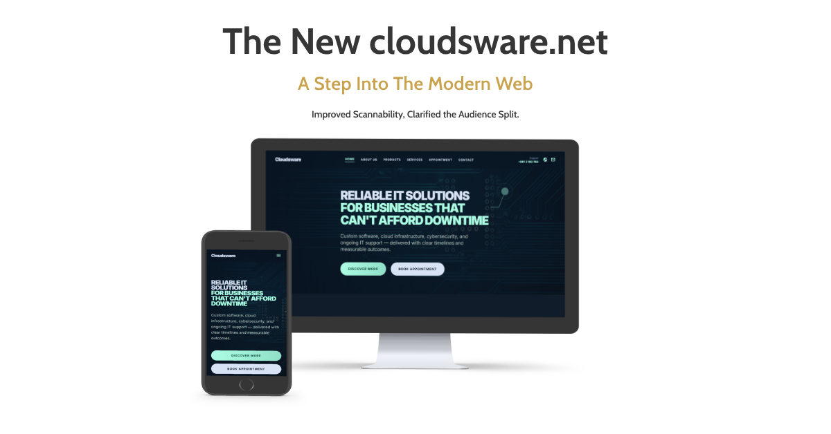
Website Redesign Case Study
Client: Cloudsware — IT solutions provider based in Saida, South Lebanon
Services Offered: Hardware sales, IT security, cloud services, backup solutions, device maintenance
Project Type: Full website redesign (UX, UI, copy structure)
Cloudsware operates in a competitive B2B and B2C IT services market in Lebanon. Despite offering a strong range of services – from enterprise cybersecurity to PlayStation repairs – their website fails to communicate that breadth with clarity or confidence. A potential client landing on the site today is met with a generic Odoo-templated layout that undersells the brand and creates friction before the first scroll.
The goal of this redesign is to position Cloudsware as the go-to trusted technology partner in South Lebanon – a brand that feels premium, approachable, and credible.
Current Site Analysis
What’s Working
- All core services are represented on the homepage
- Contact information is clearly accessible
- Basic mobile layout is functional
What’s Failing
| Issue | Impact |
|---|---|
| Generic Odoo template with no brand identity | Low trust, forgettable first impression |
| Navigation is sparse – no Products or Services dropdown | Visitors can’t explore offerings intuitively |
| Hero section is vague (“Connect to Your Digital World”) | No clear CTA or value differentiation |
| Wall-of-text service descriptions | High bounce rate, poor scannability |
| No social proof – no testimonials, case counts, or client logos | Low credibility |
“Learn more” buttons link to # (dead links) | Broken user journey |
| Footer has broken/placeholder links (About us, Products, Services, Legal) | Unprofessional and untrustworthy |
| No visual hierarchy between B2B and B2C services | Confuses the audience |
| Stock imagery unrelated to Lebanon or the brand | Feels disconnected |
Redesign Goals
- Establish a distinct brand identity: move beyond the default Odoo template
- Clarify the audience split: separate business services from personal/home services with dedicated sections or pages
- Increase trust signals: add testimonials, client count stats, and certifications
- Fix the broken user journey: every CTA links somewhere meaningful
- Improve scannability: use icons, cards, and short copy over dense paragraphs
- Modernize the visual language: dark-mode-capable, tech-forward aesthetic
- Highlight local presence: “Lebanon-based” positioning as a differentiator
Before & After — Section Breakdowns
Hero Section
Before:
White background, no imagery. A vague headline — “Connect to Your Digital World” — with two buttons both routing to the same contact page. No subheadline, no visual hierarchy, no value hook.
After:
Full-bleed enterprise data center photography as the hero background. Headline replaced with a sharp, outcome-focused statement: “Reliable IT Solutions for Businesses That Can’t Afford Downtime.” Followed by a concise subheadline covering the core offering pillars- custom software, cloud infrastructure, cybersecurity, and IT support. Two distinct CTAs: “Discover More” (primary) and “Book Appointment” (secondary). The messaging immediately speaks to a business audience with urgency and clarity.
Navigation
Before:
Three sparse links — Home, Appointment, Contact. No structure, no discoverability.
After:
Full navigation bar: Home, About Us, Products, Services, Appointment, Contact — plus a visible support phone number and email icon in the header. All links are functional and route to real pages or named anchors.
Services Section
Before:
Dense paragraphs stacked vertically with stock photos and dead “Learn more #” links. No visual separation between business and personal services. Web Development wasn’t listed as a service at all.
After:
Two distinct layers. First, a 4-pillar icon card row for core capabilities: Cybersecurity, Hardware Expertise, Cloud Services, and Web Development — each with a one-liner description. Below that, a 6-card specialized solutions grid with images and working CTAs linking to the contact page:
- Personal & Home Services
- Reliable Backup Solutions
- Security & Peace of Mind (EDR/XDR, pen testing, dark web monitoring)
- Cloud Services
- High-Performance Gaming
- Secure & Performant Websites
Every card has a real link. No dead anchors.
Hardware Catalogue Section
Before:
Did not exist. Hardware was mentioned only in paragraph text.
After:
A dedicated “Premium Hardware Inventory” section with 6 product category cards — Brand New Systems, Refurbished & Used Hardware, Enterprise Networking, Premium Accessories, Enterprise Storage, and Specialized Workstations. Each card links directly to WhatsApp for availability checks, matching how Lebanese customers actually prefer to transact.
Footer & Social Proof
Before:
Broken placeholder links (About us, Products, Services, Legal all linked to #). No social media. No trust signals.
After:
A structured 4-column footer with Quick Links, Contact details, and a Connect with Us column featuring live social links — Facebook, LinkedIn, Instagram, and WhatsApp. A “15+ Years of Excellence” badge surfaces in the homepage body as a credibility anchor. Privacy Policy is linked and real.
Color & Typography
Color Palette
| Role | Color | Hex |
|---|---|---|
| Primary Background | Deep Navy | #0B1120 |
| Secondary Background | Dark Slate | #131E30 |
| Accent / CTA | Electric Blue | #0EA5E9 |
| Accent Hover | Cyan | #38BDF8 |
| Text Primary | Off-White | #F1F5F9 |
| Text Secondary | Muted Gray | #94A3B8 |
| Success / Trust | Soft Green | #22C55E |
| Border / Divider | Subtle Slate | #1E293B |
Rationale: Deep navy conveys trustworthiness and technical authority – widely associated with enterprise IT and cybersecurity. Electric blue adds energy and modernity without being generic. The dark palette also differentiates Cloudsware from competitors using default light templates.